Problem Statement & Goals
Problem:
In the existing Quark Docurated platform, there was no built-in way for users, administrators, or content managers to see how much storage space was used, what content types were consuming space, or when they were at risk of exceeding storage limits.
When the backend systems faced storage-related issues (e.g., running out of space), users only discovered problems after something broke or when contacted by support.
Users couldn’t proactively manage or clean up old or unused content.
Support teams had to intervene manually to clear space or fix storage problems, leading to delays, downtime, and frustration.
Lack of transparency increased operational risk, especially as the content library grew.
Goal
The main goal of the storage management feature is to empower users and admins to:
Easily monitor storage usage in real time.
Identify and manage storage-heavy or outdated content.
Receive alerts before hitting critical storage thresholds.
Reduce reliance on backend support for routine cleanup.
From a design perspective, the goal was to:
Make complex storage data understandable and actionable through a clear, intuitive UI.
Fit seamlessly into the Quark Docurated product experience, without adding cognitive load.
Support proactive, self-service storage management that scales with organizational needs.
My Role:
As the Core UI/UX Designer, I was responsible for:
Designed the UI for the storage management feature.
Collaborated closely with:
Product Manager & Product Owner for requirements and priorities.
Developers & QA to align design feasibility.
Stakeholders to review and incorporate feedback.
Process & Design Approach:
To guide design decisions for Quarky Copilot AI, we used a mix of qualitative and quantitative research methods:
Understanding requirements:
Regular discussions with product team to identify:
What storage metrics matter most (e.g., total used, available, file type breakdown).
What actions users might need (delete, archive, view details).
Edge cases like quota exceed and backend cleanup.
Design & iterations:
Designed initial flows and screens in Adobe XD.
Focused on:
Clear dashboard showing usage at a glance.
Easy navigation to drill down by workspace or file type.
Actionable alerts and clean, minimal visual style.
Received iterative feedback from:
Product managers and owners.
Stakeholders focused on usability and clarity.
Refined screens through multiple design cycles to align with real-world scenarios.
Feedback-driven refinement:
Adapted the design to reduce cognitive load and highlight critical info.
Made sure the feature fits seamlessly into the existing Quark Docurated UI.
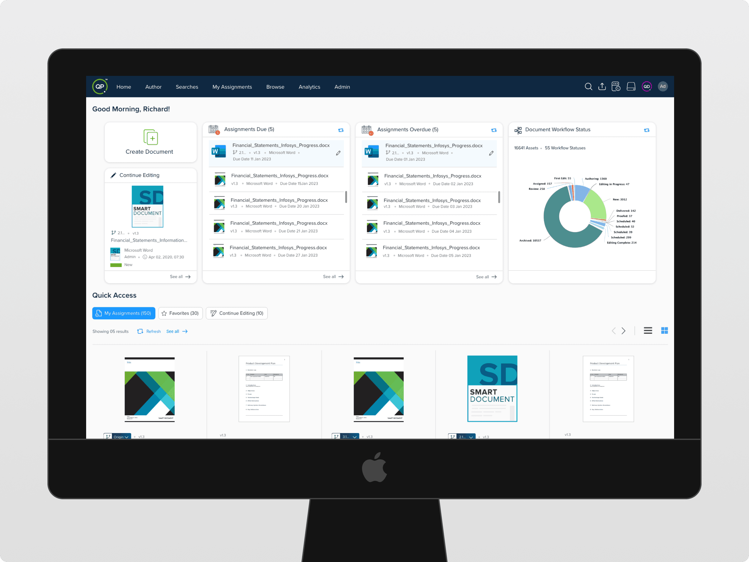
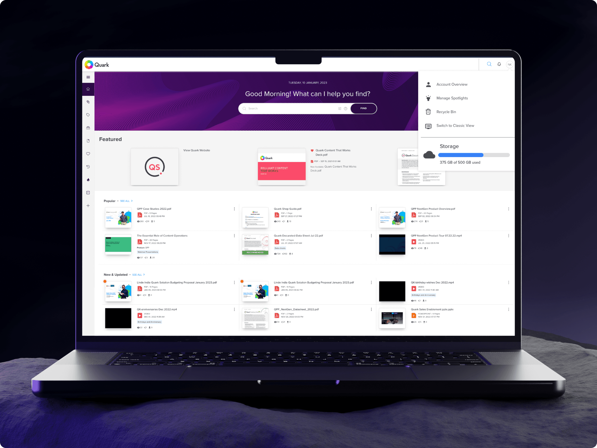
Final Solution: Key Highlights:
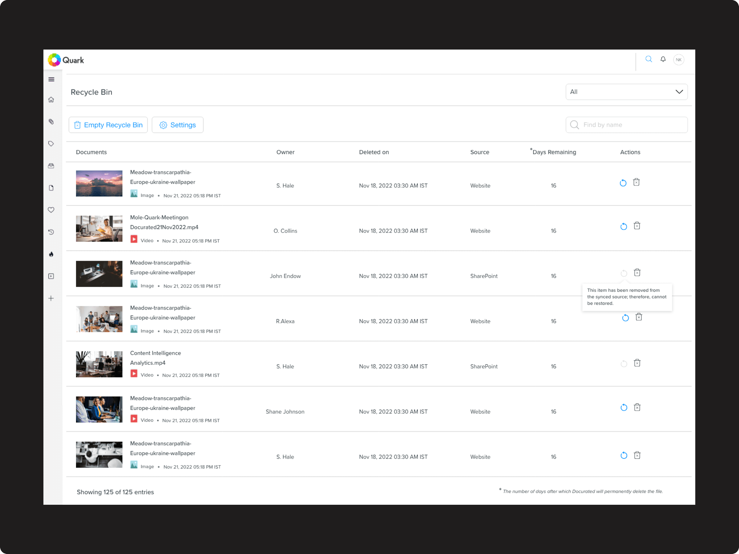
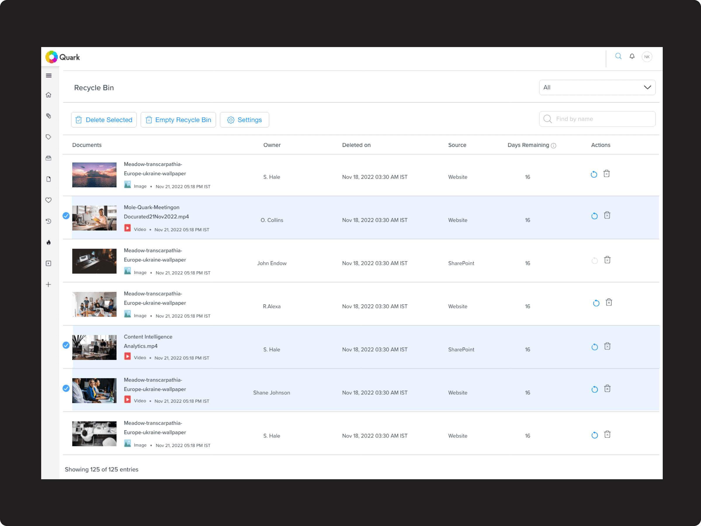
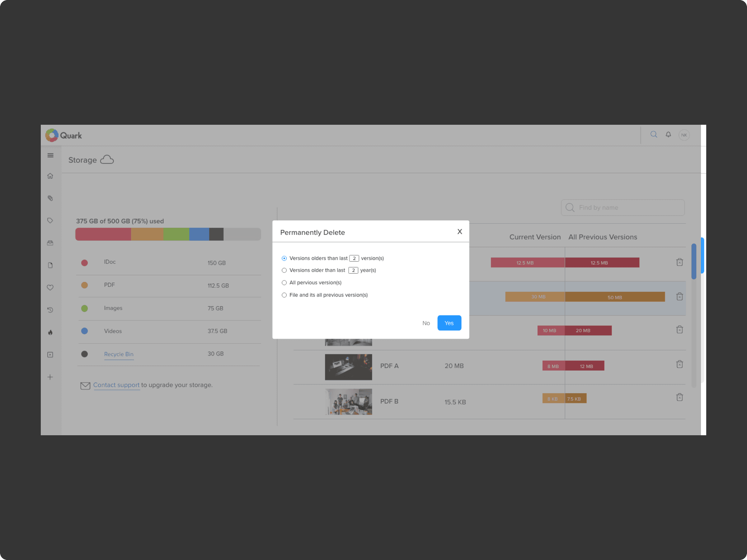
Storage Dashboard: Visual summary of total and available space, largest file types, and active folders.
Detailed Views: Drill-down to see usage by team, project, or content type.
Proactive Management: Users can clear unused files or archive older content.
Alerts & Notifications: Get notified when nearing quota or when space is freed.
Modern UI: Designed for clarity and ease of use, matching Docurated’s design language.
Impact & Benefits
Better usability: Users can monitor and manage storage without technical help.
Reduced storage issues: Prevents unexpected downtime by enabling proactive cleanup.
Improved transparency: Users see where storage is consumed, aiding decision-making.
Aligned with product goals: Supports Quark Docurated’s aim to empower users and reduce backend dependency.
Reflection
This project highlighted the power of collaboration between design, product, and development. Iterative feedback cycles ensured we built something both functional and user-friendly — turning a backend-only task into an intuitive self-service experience.