Problem Statement & Goals
The old home page was:
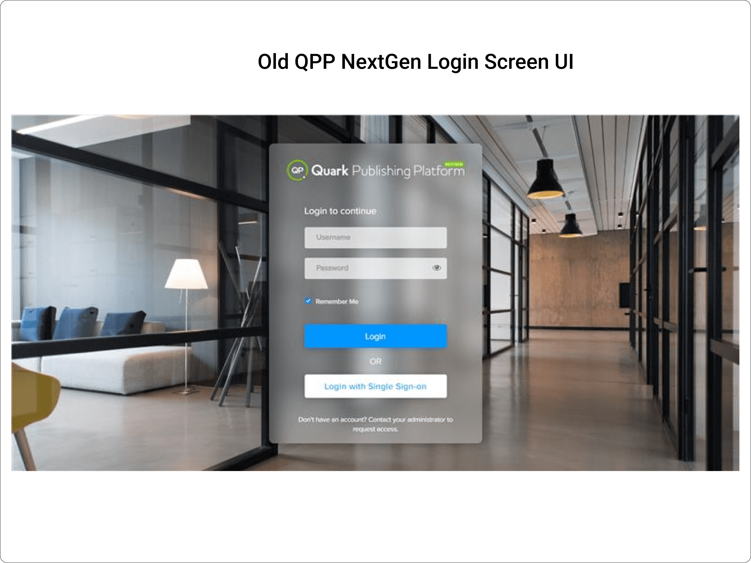
Text-heavy, with a flat list of tasks and minimal visual hierarchy
Lacked quick insights into assignments, overdue items, and workflow status
Had limited guidance for first-time or returning users
Goal - Redesign the home page to:
Improve usability and clarity
Surface actionable insights (e.g., assignments due, overdue, workflow stats)
Support power users and first-time users with better navigation and quick access
Surface key information at a glance
Modernize the UI to align with product vision
Increased engagement
My Role:
As the Core UI/UX Designer, I was responsible for:
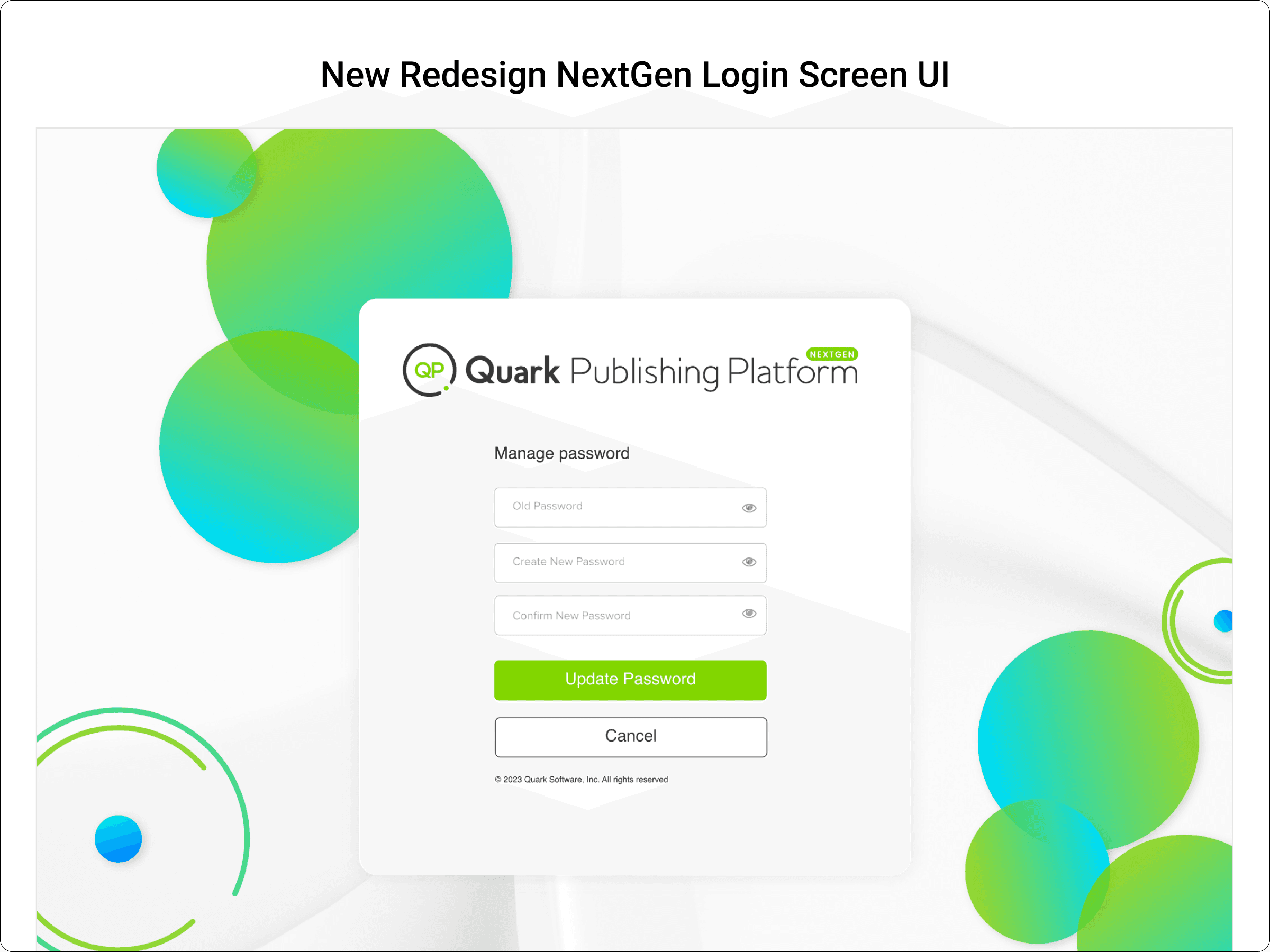
End-to-end UI design for the home and login page.
Translating requirements into wireframes, mockups, and high-fidelity designs.
Ensuring the design aligns with brand identity: playful yet professional.
Creating design assets and style guides for consistency.
Design Process:
User Research - to guide design decisions, we used a combination of:
Qualitative methods:
Stakeholder interviews: Conducted with product managers and customer success teams to identify recurring pain points
User interviews: Short contextual inquiries with 5 active users to observe daily usage patterns
Heuristic evaluation: Reviewed the old home page for usability issues (e.g., low discoverability of assignments)
Quantitative methods:
Usage analytics: Checked how often users accessed 'Continue Editing' vs. started new documents
Survey: Collected feedback from ~25 users about what information they wanted to see first
Key insights:
Users often missed overdue assignments
Many had to click multiple times to find recently edited files
Users wanted a high-level status view of document workflows
Ideation & Wireframes:
Created low-fidelity wireframes to explore different layouts (card-based, tabular)
Reviewed wireframes internally and iterated based on feedback
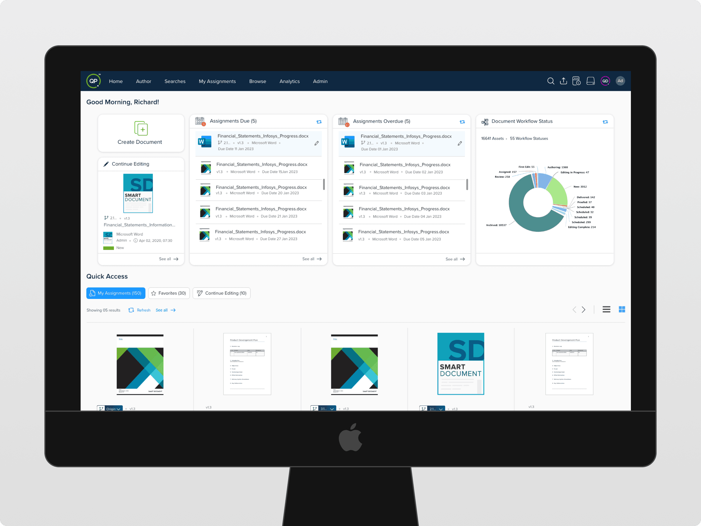
Added design elements like:
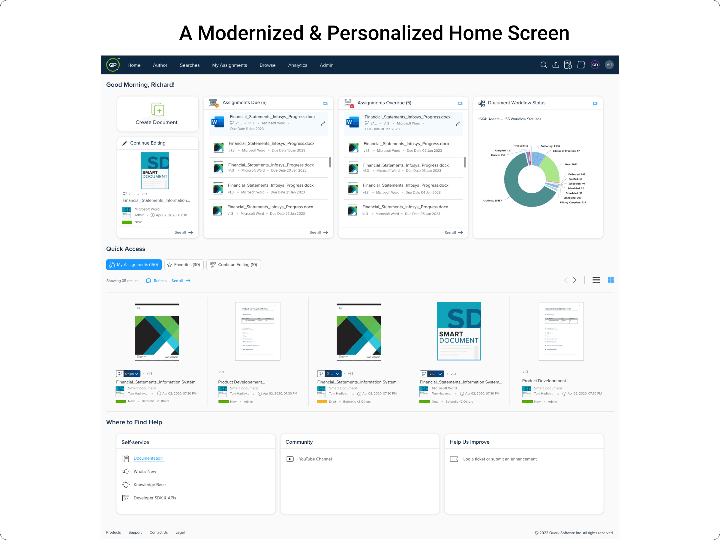
Visual cards for 'Assignments Due' & 'Assignments Overdue'
Graphical workflow summary (pie chart)
Quick Access section with tabs (My Assignments, Favorites, Continue Editing)
Design Decision and Iteration:
Issue Old | New Design Solution |
|---|---|
Flat list of documents | Modular card layout visual separation of 'Due', 'Overdue', 'Continue Editing |
No high level metrics | Added 'Document Workflow Status' chart |
No quick filter | Added tab filter under Quick Access |
Hard to find help | Added bottom section; Self service docs, community, submit feedback |
Impact & Results:
Faster task scanning & prioritization
Increased use of Quick Access section
Anticipated reduction in missed deadlines
Outcome and Learnings:
Transformed the homepage into a modern, dashboard-style view that surfaces critical tasks, deadlines, and workflow insights at a glance.
Reduced user effort by adding Quick Access, personalized greetings, and card-based sections for overdue and upcoming assignments.
Improved decision-making for users and managers through visual summaries like charts and status badges.
Realized that early wireframes and iterative feedback are essential to align design goals with real user needs and business objectives.