Problem Statement & Goals
Problem:
XANCO Jewellers, a premium watch brand, needed to elevate its digital presence to match the luxury and craftsmanship of its products.
The existing website lacked visual refinement, clear product storytelling, and an optimized user journey—resulting in a less engaging experience, especially on mobile devices.
This gap affected user trust, product discovery, and ultimately, online conversions.
Goals - Redesign Website:
Redesign the website to align visually and emotionally with the brand’s premium positioning.
Make it easier for users to browse, compare, and explore watch collections.
Improve the product detail presentation to highlight features and craftsmanship.
Simplify and streamline the checkout process to reduce drop-offs.
Design a fully responsive interface that ensures a seamless experience across desktop, tablet, and mobile devices.
Build trust by integrating clear warranty details, secure payment options, and customer service visibility.
My Role:
As the Core UI/UX Designer, I was responsible for:
Role: End-to-end UI/UX design: research, wireframes, visual design, handoff.
Translating requirements into wireframes, mockups, and high-fidelity designs.
Ensuring the design aligns with brand identity: playful yet professional.
Tools: Figma (design & prototyping), Photoshop (image optimization).
Design Process:
Information Architecture
Simplified navigation into clear product categories (Men’s, Women’s, Collections, New Arrivals).
Added a featured products section to highlight bestsellers and new launches.
Focused on storytelling through banners and collection highlights.
Wireframes & User Flows:
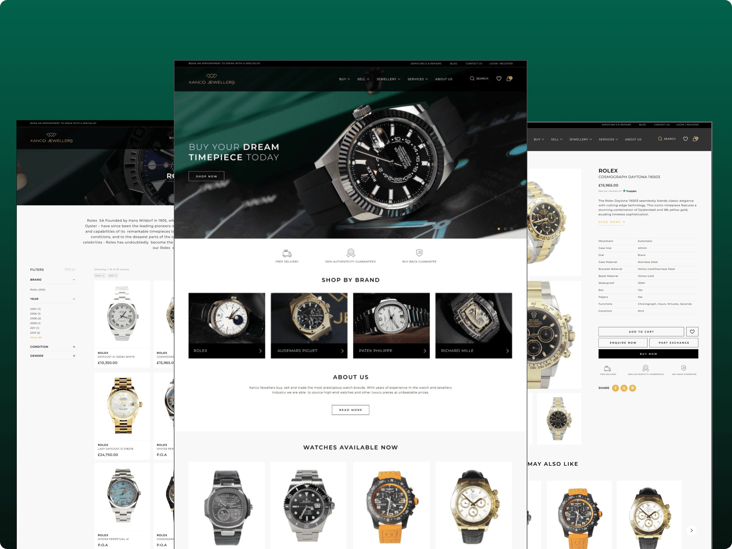
Elegant, minimalist color palette (black, white, gold) reflecting luxury.
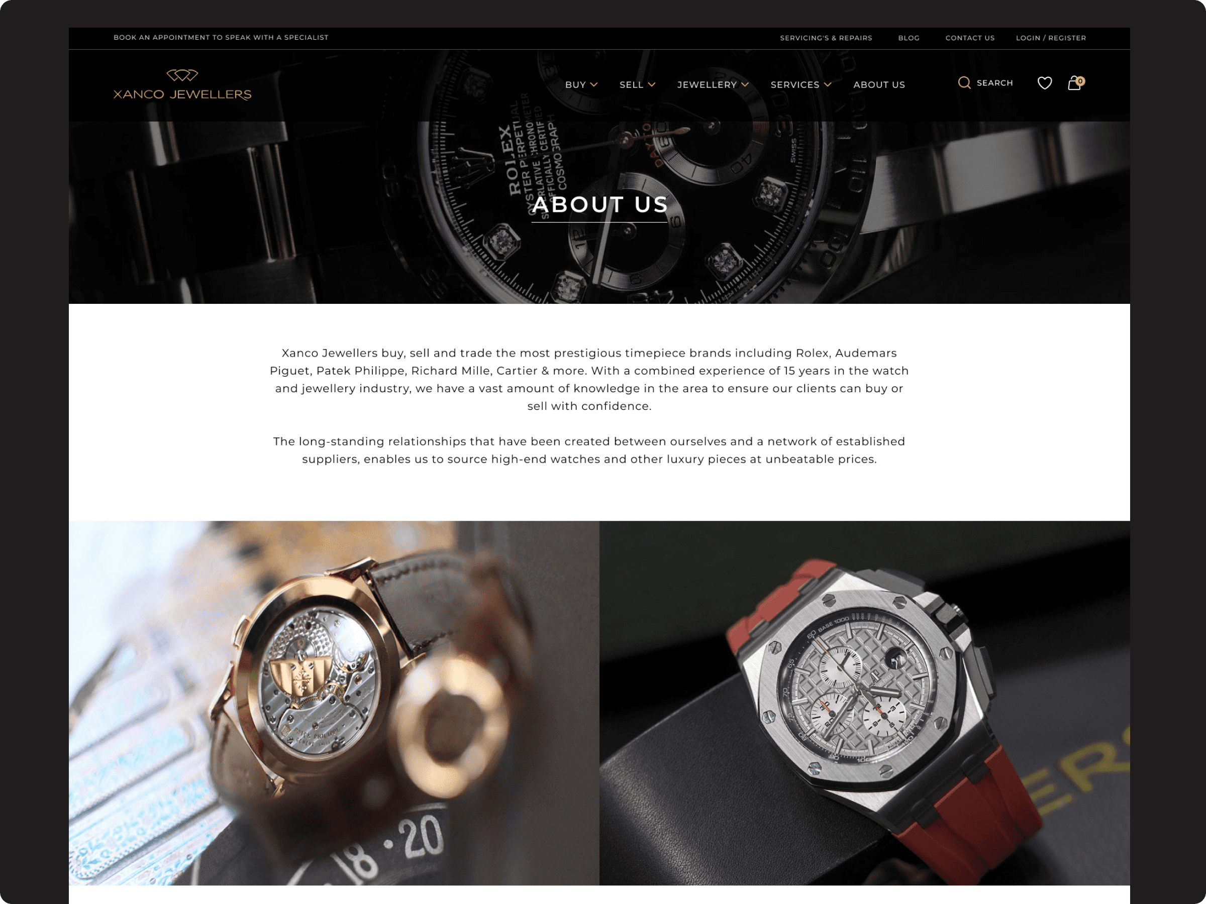
Used large hero banners with high-resolution images to convey craftsmanship.
Created custom icons and visual components consistent across pages.
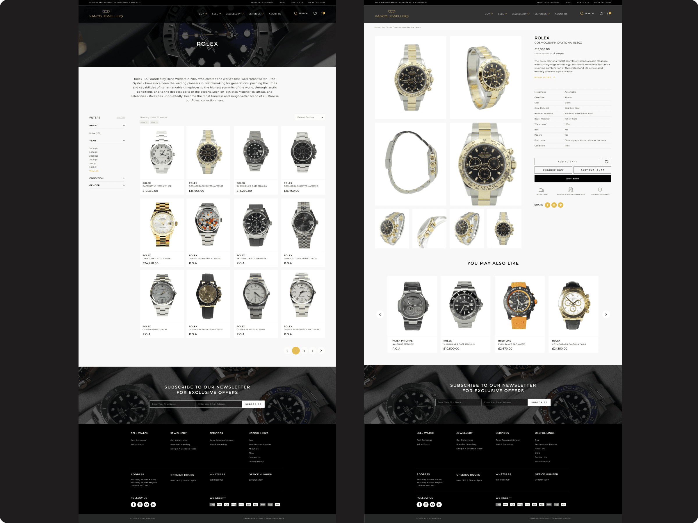
Key Features Implemented:
Hero banners highlighting collections & offers.
Product listing with quick view and filters.
Detailed product pages with specs, warranty info, and multiple images.
Wishlist and add-to-cart functionality.
Integrated trust signals and secure checkout flow.
Contact & store locator pages.
Results & Impact:
Increased average session duration by ~25%.
Improved mobile conversion rates by ~18%.
Positive customer feedback on clarity and elegance of design.
Design Decision and Iteration:
Design Challenge & Insight | Design Solution & Impact |
|---|---|
Needed to communicate luxury and brand story right from the homepage | Designed a large hero banner with high-quality product visuals, elegant typography, and concise messaging to create a premium first impression |
Users required detailed product information without overwhelming layouts | Structured product pages with spacious design, clear specifications, warranty details, and multiple product images to build trust |
Potential difficulty in browsing collections and finding desired models | Simplified navigation menu and added intuitive filters (price, collection, style) to improve product discover |
Significant mobile traffic required optimized experience | Created mobile-first responsive layouts with larger touch targets, stacked sections, and quick add-to-cart features to ensure smooth browsing on all devices |
Outcome and Learnings:
Successfully launched a modern, elegant website reflecting the premium positioning of XANCO Jewellers.
Improved user experience on mobile and desktop, making product discovery and checkout smoother.
Positive feedback from the client and early users on the clean, luxurious design.
Designing for luxury brands requires balancing visual richness with usability — clarity must never be sacrificed for aesthetics.
Early user testing, even with limited samples, helps catch small UX issues (e.g., filter clarity, CTA labeling) before handoff.
High-quality product photography significantly boosts user trust and brand perception.
A mobile-first mindset is critical, as even high-end customers primarily browse and shop from mobile devices today.